Finished Goods Marketplace.
Making it easier to discover, buy, and sell products made from recycled materials.
- MY ROLE
- UI/UX Designer
- TIMELINE
- 4 month internship
- TOOLS
- Figma · FigJam
- PROJECT
- Rebound Internship
Overview
As part of my UI/UX internship at Rebound Materials, I led the design of a new feature: a Recycled Finished Goods Marketplace, an extension of the company’s original trading platform for raw recycled materials like PET and rubber. This new marketplace enables users to seamlessly buy and sell finished products made from recycled materials, helping Rebound expand its client base and further its mission of enabling a global circular economy.
UX Research
Background
Rebound’s original platform was centered around raw materials trading, connecting global buyers and sellers of recycled input materials. However, as the demand for eco-conscious finished products grew, there was a clear opportunity to expand the platform to include finished goods. This shift required careful consideration of a new user group such as manufacturers, retailers, and institutional buyers who may not be familiar with digital trading interfaces.
Methodologies
- Competitive Analysis
- SWOT Analysis
- Key Design Findings
- Market Gap & Rebound Benefits
Competitive Analysis
SWOT Analysis
Competitors Analyzed:
- Recykal
- WasteTrade
- TerraCycle
Strengths
- Recykal demonstrates strong demand for digital marketplaces that connect buyers and sellers of recycled materials.
- TerraCycle highlights importance of communicating environmental impact and sustainability credentials.
- Validate need for centralized systems that support circular supply chains.
Weaknesses
- WasteTrade prioritizes functionality but shows dense, text-heavy UI that can be difficult for new users to navigate.
- Focus primarily on raw material or waste trading, with limited support for browsing finished recycled products.
- Often inefficient due to minimal filtering and unclear categorization.
Opportunities
- Introduce finished recycled goods to address gaps in existing raw-material marketplaces.
- Improve accessibility for users unfamiliar with digital marketplaces through clear product cards and visual sustainability indicators.
- Help buyers to quickly identify recycled material types and certifications.
Threats
- Established platforms like Recykal could expand their marketplaces to include finished goods.
- Businesses may continue relying on traditional suppliers instead of adopting new digital marketplaces.
Key Design Findings
Based on competitor analysis, I identified three opportunities for Rebound’s marketplace:
- Simplify Product Discovery — Existing platforms lacked clear categorization and filtering.
- Improve Accessibility — Many competitor interfaces felt dense and technical.
- Build Trust in Sustainability — Competitor platforms under-emphasized recycled certifications.
Market Gap and How Rebound Can Benefit
Competitive analysis of Recykal, WasteTrade, and TerraCycle revealed a clear market gap: most platforms focus on raw materials, waste trading, or recycling services rather than finished recycled products. Many also rely on complex interfaces that make product discovery difficult for buyers. Rebound’s Finished Goods Marketplace addresses this opportunity by creating a more accessible buying and selling experience through clear navigation, streamlined filters, and visible sustainability credentials. For Rebound, this feature expands the platform into a new market, attracts additional customers, and further supports its circular economy mission.
Typography
Design Decisions and Execution
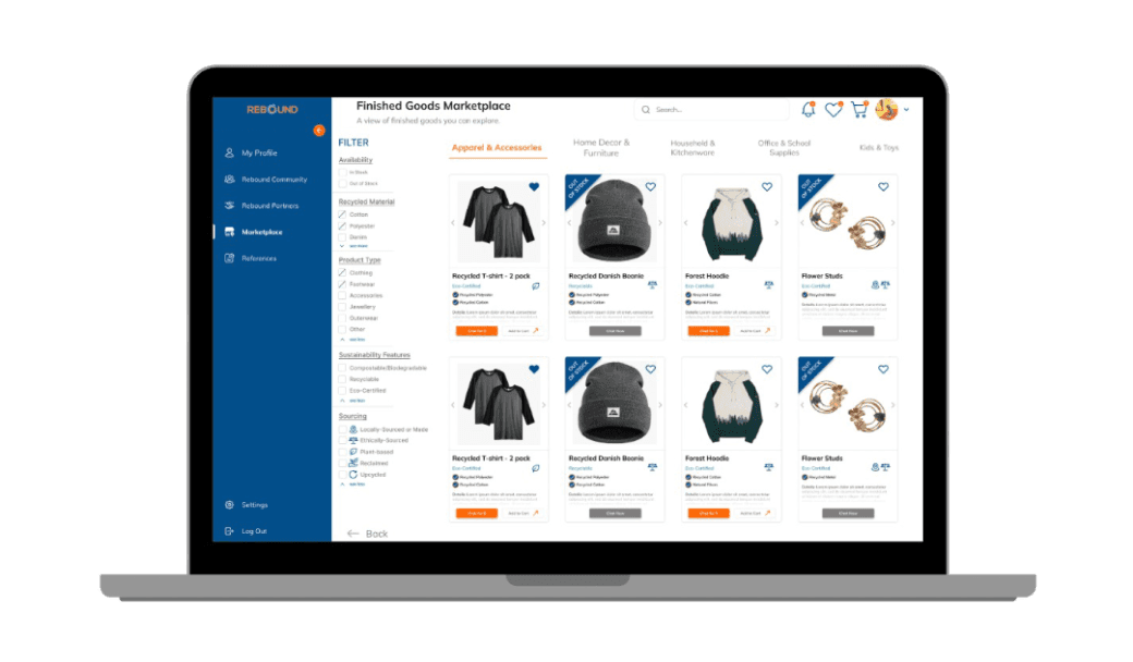
Structured Product Cards for Quick Scanning
I designed product cards to surface key information, material type, certifications, and availability, at a glance. This reduces the need for users to click into multiple pages and supports faster decision-making.
Filter-First Browsing Experience
Many competitor interfaces felt dense and technical, so I created a cleaner UI optimized for older and less technical users.
Visual Hierarchy for Clarity
I used consistent spacing, iconography, and typography to guide attention from product image → title → sustainability details → actions. This creates a predictable and easy-to-follow browsing flow.
Integrated Sustainability Signals
Sustainability indicators are embedded directly within product listings rather than hidden in detail pages. This ensures users can evaluate products without disrupting their browsing experience.
Familiar Marketplace Interactions
I incorporated recognizable patterns such as “Add to Cart,” “Chat Now,” and wishlist icons to reduce the learning curve and make the platform feel intuitive from first use.
By prioritizing accessibility, product discoverability, and sustainability transparency, the design creates a more inclusive and scalable marketplace experience that supports both new and existing users.